


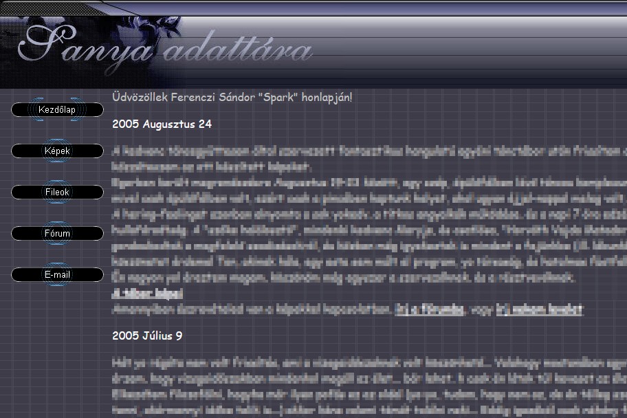
Have you ever seen an ugly website? So have we. More than one. But “ugly” can mean a lot of different things – and when you look closer, it turns out that some ugly websites are not bad websites at all. In fact, some of them perform remarkably well.
Not all ugly websites are the same
Before passing judgement, it is worth asking why a site doesn’t appeal to you.
The neglected site
Some sites are simply unreadable. Yellow text on a blue background, elements falling apart on mobile, or an overall look as if it had been built in a high-school IT class in the early 2000s: everything left-aligned, a photo as the page background, Comic Sans throughout. These are usually neglected sites with little traffic – not ugly because someone decided they should be, but because nobody has looked at them for years.
The annoying site
Then there are the flaws that irritate more than they offend the eye. It isn’t clear what you can click and what you can’t. There is too much animation, everything moves, flashes and slides in. Or the price is invisible because it is exactly the same colour as its background. These aren’t really design shortcomings but functional bugs: the visitor gets stuck, starts to hesitate and eventually leaves. If you want to hunt for these on your own site, we have collected a few UX tips worth starting with.
A well-maintained site can still be ugly
On a regularly maintained website, the problems above are usually absent. That doesn’t stop it from being ugly. Not only because taste differs from person to person, but because beauty and functionality don’t always go hand in hand.
For the owner running the site, it matters far more that visitors follow the path the site was designed for than that it wins beauty contests. The two aren’t mutually exclusive, of course – we learned on a rooftop bar’s website that good design and good function can work together. But when you have to choose, the goal wins.
The Temu lesson: ugly, yet millions order from it
Think of Temu. We could hardly name an uglier webshop. Yet you have almost certainly ordered from it, just like millions of other people. Why?
Because it is optimised for conversion. It takes you by the hand from the very first moment, gauges your interests, then guides you through the purchase. Did you admire anything along the way? Hardly. But it was always clear what to click to finally reach the “thank you for your order” page – because that is every webshop owner’s goal.
The popup that appears at the best part
One of our favourites is the popup that appears just as we are trying to read the deepest details of a page’s text. You can almost hear the music fade, the hero freeze – and then the jumpscare arrives in the form of a popup window. Your heart jumps, your reading stops.
And yet it works. Annoying, not pretty, not elegant – but it shows in the number of sign-ups, coupon redemptions and orders. It’s the same logic as Temu’s: the question isn’t whether you like it, but whether the visitor takes the step the page exists for.
What this means if you’re thinking about a redesign
The next time you think “I should refresh the look of my website”, don’t start with colours and fonts. First ask yourself these two questions:
- What is your webshop’s primary goal? An order, a quote request, a sign-up, a booking – the one main step you want visitors to take.
- Once the visitor is there, how can you show them that goal in the most targeted way? Is it obvious at first glance what to click? On mobile too? Is there anything distracting them from it?
Once you have the answers, the design will serve that goal – and it may well become prettier as a result. If it doesn’t, that’s fine too, as long as visitors make it to the “thank you” page.
Fun fact: the cover image of this post is one of the first websites of a young, ambitious future web developer, straight from an IT class. 🙂
Is your website built for a beauty contest or for the finish line? Write to us and we’ll happily click through it with you through a visitor’s eyes.